Sunday, 31 August 2008

An Eggs-traordinary Toilet

If you want a toilet experience that's out of this world, you must visit Sketch.  It's a gallery, restaurant and bar located on Conduit Street in London's West End.  But the best part about it is the loo!  To get there, you walk through the restaurant, into a spaceship-like zone.  You then walk up the stairs- ladies go right, guided by the pink lights, gents go left, guided by the blue (obviously).  
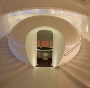
Once you get to the top, you feel like you've arrived on another planet.  The cubicles are egg shaped pods to which you enter at your peril!  As you sit on the loo, you're greeted with strange noises, to enrich your err, sensory experience.  I've come across the tinkle of cattle, baa-ing sheep, coughing fits and hysterical laughter.  It's all very surreal and you emerge out of your egg, like a little chick.  

It's not to everyone's taste- I know some people who couldn't get out of their pods quick enough.  But as far as I'm concerned, anywhere that makes a trip to the toilet exciting is pretty impressive!


Thursday, 28 August 2008

Wallace and Gromit: The New Stars of Fashion


Wallace and Gromit have been chosen as the face of the launch campaign for Harvey Nichols in Bristol.  Looking slick in Dolce & Gabbana and Paul Smith, they've been joined by Lady Tottington who models an Alexander McQueen dress. It looks like Wallace is enjoying his new role as a fashion icon, while it's nice to see that Gromit's familiar quizzical expression suggests he's taking the fashion industry with a pinch of salt.  It's always nice to see some humour injected into fashion advertising and it's something that Harvey Nichols does well.  The campaign was created by DDB London.

Chinatown Art

When I was in San Francisco, I was taking a stroll through Chinatown when I came across this fantastic building.  It's been covered in murals that depict the cross culture in the surrounding area.  On one side, are traditional Chinese characters and motifs and on the other are symbols of American life.  But it was the clothes hanging to dry on the balconies that I found the most charming.  It's nice to see people living, doing normal activities within this eye catching structure.  Sometimes it's the most ordinary, real things that make you smile.

A Clockwork Orange

I know most people have seen the film, but if you haven't read the book yet, it's a must.  I read it recently and it's already one of my favorites.  For me, the charm was all in the language.  Anthony Burgess writes using an Anglo-Russian slang called Nadsat and it's these words which make it so unique.   A few of my favorites being 'goober' (lip), 'gulliwuts' (guts) and 'toofles' (slippers).  The almost comic style of writing makes an interesting contrast to the violence in the book.  There's a whole glossary at the back so you know what's going on, but generally, you get the idea.  It's good to look at just for inspiration, especially when needing copy writing ideas.  Sometimes English just doesn't convey meaning as well as a bit of chepooka language...

Mini Polaroid People


I found these images on http://www.ffffound.com and I think they're really intriguing.  They were an entry to a polaroid competition, but I don't know who the artist is.  The shallow depth of field creates an obscure feel, focussing your attention on the miniature characters.  The person that made these wee little people must have had tiny fingers- they're microscopic!

Green Graffiti


I think the concept of environmentally friendly graffiti is really interesting.  Graffiti can be seen as damaging our environment, but when using a biological medium, it can only be seen as a positive thing.  This was created by Anna Garforth, an illustrator.  You can see more of her work at:

Transamerica


Hmm...I seem to have started a bit of a transsexual/transvestite theme in this blog.  Anyway, I saw this film last night and it's brilliant.  Felicity Huffman (woman) plays a man, trying to become a woman.  Her performance is so convincing, you really start to believe it.  A week before the big operation, she discovers she's the father to a son from her only sexual experience.  In her attempt to rescue the runaway son, she goes on an unexpected journey with him to LA.  The film follows the start of their relationship that becomes all the more hilarious as new characters come in and secrets become revealed.  

Wednesday, 27 August 2008

Nokia Music Almighty Campaign

The microsite for Nokia Music Almighty is worth a look for a bit of fun. The interactive site allows you to choose from 5 sets of headphones, each representing a different genre of music. Once you plug a set into the phone, the headphones come to life as the music starts to play. You can then upload your own picture and wear the headphones. Your face can be transformed to look more like the stereotype associated with that genre of music (yes, that's me looking bling with a beard). It can become more of a caricature and be made to look older/younger and happy/sad.


This is the second part of the Music Almighty campaign by Wieden + Kennedy. It was created by Ida Gronblom and Fabian Berglund who I met a few months ago at a book crit at the agency. After meeting them in person, it's inspiring to see their work in action.  The TV ad is visually stunning and also celebrates the diversity of music.


Black Cab Sessions

The concept of this site is simple. An artist is put in a black cab and driven round while they sing a song or two. The focus is on the raw essence of the music which is encouraged by the intimate back seat environment. The London cabbies introduce each session, adding to the charm of the whole thing. It's a great way to see the artists you love up close and personal and to discover cool new music.

Have a look at:

http://www.blackcabsessions.com

Tuesday, 26 August 2008

Photo of the Day


http://photooftheday.hughcrawford.com/

This website records the life of Jamie Livingston, a filmmaker, who in March 1979 decided to take a polaroid image for each day of his life. It's a fascinating visual diary that captures images over 18 years. It's intriguing yet you can't help but feel a bit voyeuristic, looking through his personal photos of friends, family, holidays and ordinary days. Images range from happy snaps, to abstract, all changing with the times and fashions. But throughout is the constant, reliable frame and fuzz of the polaroid. In 1997 the photos start to take a dark turn when images of the photographer in hospital start to appear. Then, on October 25th the photos end- he has died from a brain tumour. Although, the series ends on a shocking, sad note, the overall feel of the album is fun, heartwarming and moving. It's a beautifully simple way of recording life with each image saying so much.

Philips Satinelle Ice

I think this ad by DDB London is brilliant. I came across it today but it apparently came out a few months ago (I guess I'm a bit behind the times). It's a refreshing change from the typical ads for beauty products and their shiny, happy, unattainably beautiful models. What better way to promote the fact that this product is gentle and pain free by using a man (yes, men can't handle pain like us girls) to promote it. And can I say, this man is one hot mamma. A memorable, real and inspirational ad- bravo DDB!!

Wednesday, 20 August 2008

PingMag


A cool website that's should be checked out is http://www.pingmag.jp
It's an online design magazine based in Tokyo that covers a whole range of subjects; from illustration to product design to advertising to traditional crafts.  Articles and interviews with artists and designers are added every couple of days so it's a great source of inspiration.  The feature on Visual Kidnapping is worth a look.  It's about the French street artist, Zev, who distorts the logos of big brands.   http://pingmag.jp/2008/08/11/zevs-visual-kidnapping/


Tuesday, 19 August 2008

Bela Borsodi

One of my favourite artists of the moment is the still life photographer Bela Borsodi.  He looks at objects in a whole new light, challenging our perception of them by giving them personality.


His work is always imaginative and often humorous.  Being in the world of fashion, it's a refreshing change to see some fun injected into a fickle industry that takes itself so seriously.  

In his series "Foot Fetish", featured in V Magazine (above), he visually explores the way high heels change the shape of the female body and sexualize it.  He looks at how the body fits the shoe in an exaggerated way by playing with shape and proportions.  Rather than doing it on Photoshop, he shot the nude models, cut out the prints then placed them within the shoes.  I love the way he's transformed shoes into these surreal, striking images and brought attention to the connotations associated with shoes.

You may recognize the image above which was shot as part of a series of ads for Selfridges.  If you want to check out his work go to: 

Sunday, 17 August 2008

Psycho Buildings- Artists Take On Architecture

This is one of those brilliant exhibitions that's fun, fascinating and people friendly.  It's not too wanky as far as modern art goes.  There are 10 exhibits in total, ranging from an eerie village of 200 lit up dolls houses to a room frozen in an explosion.

The exhibition takes place both within and outside the Hayward Gallery, with the outdoor exhibits being more interactive.  The first is a boating lake that's been built on one of the terraces.  It's a surreal experience rowing above ground looking down on London.   The downfall is that we queued for almost an hour to have a go, which wasn't exactly worth the time.  So if you go and there's a long queue, just take a peek as you'll get the idea.

My favourite outdoor exhibit was the "Observatory, Air-Port-City" by Tomas Saraceno.  It's a transparent dome with a roof that allows people to walk about, giving the illusion that they're floating.  Inside, is a space that's protected by an air lock door which keeps the atmospheric pressure balanced.  You lie down, looking up at the people floating above being supported on the pillow of air.   The best way to describe it is to imagine yourself as an ant trapped inside a transparent ball.  A pretty cool experience for £10 I think...    


ChickPizz

I was in Stoke Newington on Friday night and came across this delightful restaurant.  Now this is a prime example of signage that's straight to the point.  There's no confusion about what they sell here.

And to illustrate the point further, they've added a cute little picture of what's on the menu. Mmm appetizing...

Tuesday, 12 August 2008

Frieda Kahlo


During my time in San Francisco I couldn't help but notice images of Frieda Kahlo's work all over the city.  Publicity for her exhibition at the San Francisco Museum of Modern Art was plastered everywhere.  So being the sheep that I am, I thought I'd follow the crowds and check out what all the hype was about.  The queues were huge to get in and you had to get in with a special timed ticket.  But it was well worth the wait. 
 
Although her work isn't something I'd necessarily want hanging up in my room, it is amazing.  Her folkloric style is influenced by her Mexican roots and many of her paintings have a Surrealist feel to them.  Although she denied she was a Surrealist, stating "I never painted dreams.  I painted my own reality".  It's this reality about her life and thoughts, that makes her work so intriguing.  It's shockingly personal and you can't help but get sucked in by the tragedies in her life, wanting to discover more about her.  

Doritos Collisions


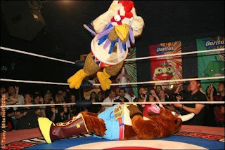
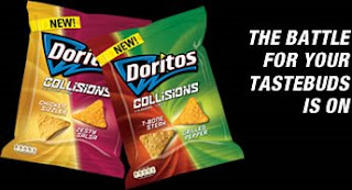
Continuing my work for Doritos, last Thursday I went to the most random event to launch their new line called "Collisions". It's basically 2 flavours in one bag (Crraaazzy!!). And to launch it, they had a wrestling night.  First of all was some Lucha Britannia action, then the flavours got down and dirty in the ring to fight for champion. I was supporting "Tenacious T" (representing the oh so tasty T Bone Steak flavour). He's the brown cuddly bull in the picture above, about to get squashed by "Feathered Fury". He eventually made it through the trauma and won the championship- hurrah!  The event was a great way to promote the new product as it was entertaining, different and perfectly suited to what the product is about.

Beggars to Exiles


While I was in San Francisco, I popped into this great little art gallery called the San Francisco Art Exchange. It's located on Geary Street which is crammed full of lots of lovely independent galleries (and obviously a dozen Starbucks- you just can't get away from them!!) This exhibition follows the Stones' evolution and captures the rock n roll lifestyle that you can only dream of having. It's based on the photography of Michael Cooper and Dominique Tarle. Michael Cooper captures images from 1966 to 1970, while Tarle's images are from 1971 when the band recorded "Exile On Main Street".

The exhibition not only features The Stones, but the women that influenced them including, Marianne Faithful and Anita Pallenberg (seen above). While we were looking around the gallery we got chatting to one of the art dealers who kindly showed us parts of the gallery that weren't available to the general public. We were taken to the store room that had stacks and stacks of original artwork from bands such as Pink Floyd to Yes. It was amazing!! The stuff in that room must have been worth millions. If only I could afford a square inch of one of those prints...

Monday, 11 August 2008

Slick Design in Seattle


These magazines caught my eye when I was in Seattle last month. They're free weeklys about the city, providing info about what's on that week. I was quick to scoop up a copy of each as I love the design, particularly the covers. The artwork, colours and typography really grab attention. They're printed on newsprint which gives them a raw, down to earth feel, which works well with the retro designs. I like the way the two magazines compliment each other, especially in that both cover headlines are attractively morbid!

Doritos Ad Competition

So, over the past year I've been doing bits and bobs of work for a company called Face. They're a youth marketing agency and they get young people to think of the ideas behind big brands. So far I've done work for Sure, Lynx and I'm currently working with Doritos for the next year. A couple of months ago they had this national competition to get the public to make their next ad. I think it's a pretty genius idea as it's fun and it gets the consumer involved in the brand. They also offered a whopping £20,000 for the winning ad which was to be aired during the World Cup and it was also the first ad to be beamed into space!! I helped judge the entries, and week by week we whittled them down. Unfortunately I couldn't make the final judging session but this is the winning entry:


Personally, this wasn't my favourite. Considering over 900 people entered, I thought this was a pretty disappointing choice. It's been well executed but it lacks edge and excitement. One of my favourites was this one, which I think is hilarious:


I think it's quirky and witty. I love how they've elevated Doritos to being currency- something that's of value. They're selling Doritos from a different angle to your typical snack advertising which I think would have made this ad stand out on TV. If you want to see more of the ads go to

http://www.doritos.co.uk/